
The State Farm logo stands as one of America’s most enduring and recognizable corporate symbols. With its distinctive three red ovals arranged in a triangular formation, this emblem has represented the insurance giant through nearly a century of business evolution—from a small farmers’ auto insurance provider to the nation’s largest property and casualty insurer.
Origins and Evolution (1922–Present)
1922–1936: The Single Oval When George J. Mecherle founded State Farm Mutual Automobile Insurance Company in Bloomington, Illinois, the original logo featured a single horizontal oval badge with a double outline. The centerpiece displayed a monochrome vintage automobile surrounded by the company’s four principles: “Service, Satisfaction, Safety, and Economy.” This black-and-white design established the oval as the foundational shape of State Farm’s visual identity
.
1936–1953: Birth of the Three Ovals The pivotal transformation occurred in 1936 when State Farm introduced the iconic three-oval configuration. Each oval depicted specific imagery representing the company’s expanding services: an automobile (auto insurance), a fire engine (fire protection), and a cornucopia with crops (agricultural and life insurance). This redesign introduced the bold red and gold color palette that would define the brand
.
1953–2012: The Classic Era The 1953 redesign produced the most recognizable iteration of the logo. Three solid red ovals with white outlines were enclosed in a square frame with rounded corners, each containing text identifying “Auto,” “Life,” and “Fire” insurance. The interlocking bottom two ovals formed an infinity symbol, subtly suggesting eternal protection. This design remained largely unchanged for nearly 60 years, building tremendous brand equity
.
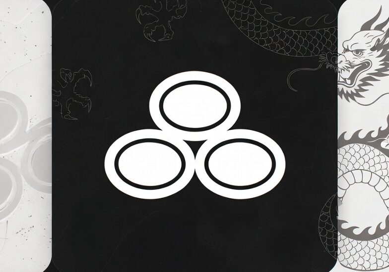
2012–Present: Digital Age Streamlining On January 1, 2012—State Farm’s 90th anniversary—the company unveiled its current minimalist design created by the prestigious New York firm Chermayeff & Geismar. The redesign removed all text from within the ovals and eliminated the square frame, leaving only the clean three-oval triangle beside a refined “State Farm” wordmark. According to marketing vice president Pam El, this change was necessary to create “a bolder presence that could compete in today’s digital world”
.
Design Elements and Symbolism
The Three Ovals The triangular arrangement of three ovals originally represented State Farm’s core insurance offerings: auto, life, and fire coverage. While modern versions removed the labels, the structure continues to symbolize comprehensive protection and interconnected services. The pyramid formation—with two ovals at the base and one at the top—creates visual stability and balance
.
Color Psychology State Farm’s signature red (Hex: #ED1D24, Pantone: PMS 485 C) was chosen for its psychological associations with strength, confidence, reliability, and passion
. The high-contrast white elements suggest honesty, transparency, and cleanliness. This red-and-white palette has remained consistent for decades, ensuring instant brand recognition across all media platforms
.
Typography The current logo uses a custom sans-serif typeface called State Farm News Gothic (similar to Frutiger Bold Italic), commissioned specifically for the 2012 redesign. The italicized treatment suggests forward momentum while maintaining professional credibility. Notably, the custom font is named Mecherle after founder George J. Mecherle, honoring the company’s agricultural roots
.
Brand Impact and Distinctiveness
State Farm’s logo evolution demonstrates exceptional brand management—preserving essential identity elements while adapting to changing market conditions. The company has built what branding experts call “distinctive assets”: the three-oval logo, the red-and-white color scheme, the iconic “Like a good neighbor” jingle (introduced in 1970), and the beloved character “Jake from State Farm”
.
The 2012 simplification proved strategically brilliant for the digital age. By removing the words “Auto,” “Life,” and “Fire,” State Farm freed itself from being perceived as solely an insurance company, accommodating its expansion into banking, investments, and comprehensive financial services. The streamlined design scales effectively from smartphone screens to massive billboards—a crucial advantage in modern multi-platform marketing
.
Today, the State Farm logo appears in various formats: the full lockup with wordmark, the standalone three-oval emblem, and a digital app icon featuring the ovals on a gradient red background. This versatility ensures brand consistency whether customers encounter State Farm through traditional advertising, mobile banking apps, or social media campaigns .